Rules of Composition in photography
Anyone can click the shutter release on a camera and take a photo, but what makes a photo stand out from the rest? This can be answered in one word, Composition.
Composition– is the different elements you see in the viewfinder which balances and complements each other . To understand composition is to know what these elements are and know how to put this knowledge into practise when taking a photo. You will be amazed at the improvement of your photos once you understand composition.
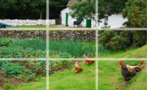
1- Rule of thirds -An image is broken up into three equal parts.the background, the middleground and the foreground. and can also be broken up into square box’s 3 on top ,3 in the middle, and three on the bottom. If you look at the image of the cottage with the chickens in the field. The horizon line is a third of the way from the top, parting the background from the middle ground. The cock on the left of the image is taking up the space in the foreground, The lower third of the image and also the right hand side third of the image. Everything is broken into thirds! This is one of those things that most photographers do naturally, and some without realising that they are using this rule of thirds. If you divide your frame into thirds horizontally and vertically with equidistant lines, the main part of your subject ,in an image, should be where the vertical lines meet the horizontal lines.
2-lighting and exposure– There is nothing worse than a photo that is not exposed correctly, if it is too bright it is over exposed, if it is too dark it is under exposed.By using the light metre on your camera, you should get the perfect exposure. This may not always be the case as sometimes you want a low lit image or even a very bright image ,but for general photography go with your light metre, it will tell you if the image is too bright or too dark.
3-background, foreground – most people when taking photos concentrate on the subject they are taking the photo of which is mainly in the foreground, no mater what the subject the background will have an effect on your final image, so you need to be conscious of the background, as it can turn an o.k photo into a really good photo. As in the country scene above, if I just took a close up of the cock in the field it wouldn’t be as strong an image as the cock in the field with the cottage scene in the background.
4- Angle to subject -Low angle –By taking a low angle of a subject you add drama to a shot e.g. a low angle shot of a child makes it look like a giant.
5- Depth of field in relation to focus– This refers to how much of the image you want in focus, for landscapes you want a large depth of field and with close up photos like macro you want a small depth of field where the subject is in focus and all around the subject is blurred. this has been dealt with previously in Camera modes
6- Room to crop – A lot can be done to an image in post production so if you allow some space all around your image it just gives you more Leigh way when editing the image, you might see something in the image that you didn’t see when you were taking the photo, leaving room to crop may give you different options.
7- a balance of color and texture. If you photograph something that has mainly one color the result may not be great if you add in a colour which is beside that colour on the colour wheel, a harmonious colour, suddenly colour has made the subject more pleasant to the eye.Now enhance the texture and you have changed a very flat boring image into one that stands out.To enhance the texture you may consider using HDR or lighting your subject from the side. The photo of the nettles has used colour and texture in a balanced way to great effect.
8- White balance– This has been dealt with in a previous blog white balance definition
9- Portrait or landscape? -A Portrait photo is (slim and tall) A landscape photo is (small and wide).for example when taking photos of people,if there are two people in a portrait use portrait,if there is a group of four people or more use landscape. A lot of photographers forget to turn the camera for portrait photos, they are so used to photographing everything in landscape, if you know what you want to capture,Don’t forget to turn your camera for portrait framed photo’s ,every image you see is not best framed as a landscape.
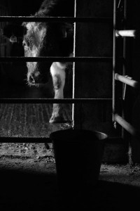
10 – Contrast between light and shade-When looking for something that highlights light and shade ,look for daylight peering into a dark place, you can get the best out of black and white photography in theses places. You may need a tripod as light maybe minimal and you need to use a slow shutter speed.
11-Vanishing point-All perspectives have a vanishing point; this is the point where lines converge. A vertical perspective like a building the vanishing point is where the base and top lines meet .On a horizontal perspective it is where two parallel lines meet e.g. a railway line. You can use diagonal lines going to a vanishing point as a lead in space pointing to your subject.
12- Lead in space- Most of the time your subject is in the middle of the image but you can use an empty space to give more impact to an image. For example if your subject is walking from left to right, if you put the subject in the middle of the image it looks unbalanced, if you put a lead in space on the right of the image to where the subject is walking to, this gives the image a sense of movement and balances the image.
13- Individuality- All the above points help the composition of a photo but ,as in all artistic walks of life ,individuality is what makes most peoples work stand out from the pack. Your style of photography may be in direct opposite to some of the points made above and this can also work, bad composition in certain cases can be good composition. but in general the above points work for most photographers.
General Tips when taking photos
1- Focus on focal point and then set up subject
2- Get rid of props which take from composition i.e.. a handbag
3- Look for texture which implies depth
4- Horizontal line should be straight.


Get Social